The section
In January 2014, ten months before we actually arrived in New Zealand, we found an interesting piece of land that was for sale online. 13,870 m2 on a hilltop with great views both to the sea and to the river valley. In Austria it’s almost impossible to buy such a large section, they just develop sites of typically 700 m2. Not so in New Zealand. Just a few km away from town center the rural residential zone allowed us to get 20 times as much, for a similar price. We haven’t even seen the section in real, but we couldn’t take the risk of being too late when we would arrive in October, so we bought it online.
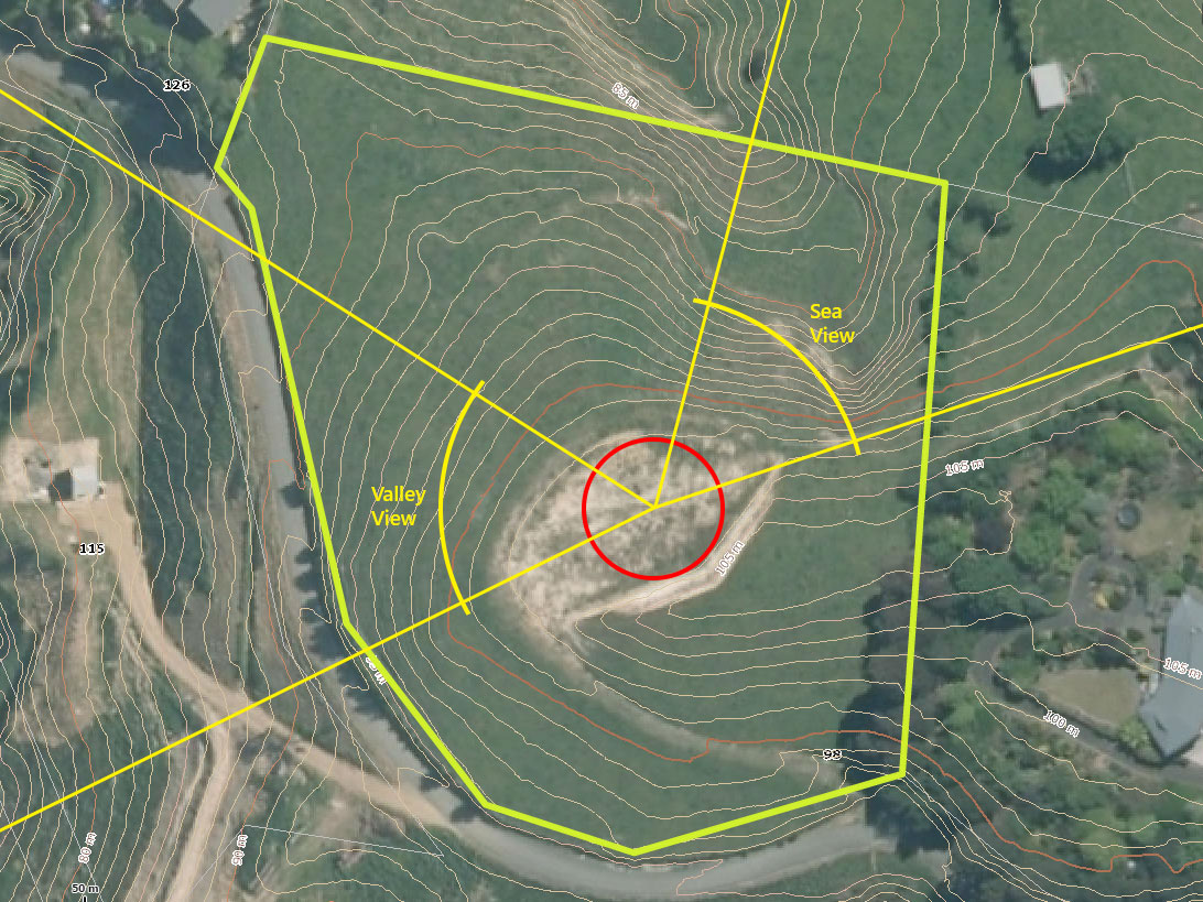
The previous owners already created a building platform a couple of years earlier, which we decided to enlarge a bit further for the garage. The developer of all the sections in our neighborhood thought it would be a good idea to specify a building circle (in red on the picture) that restricts the area for building houses. Though, garages and other small buildings could still be erected outside that circle. Good enough for us.
The views and the sun
It took me about four months and eleven design concepts to come up with a layout that meets the following basic criteria:
- We would like to enjoy both the sea and the valley views from the open plan kitchen because that’s where we mostly are.
- We would like to see the sun rise in the kitchen and the sun set on the living room/deck side.
- We would like to have the afternoon sun in the children’s rooms as they are at school in the mornings anyway.
- The total area of the house should not be much more than 200 m2.
This is the result:
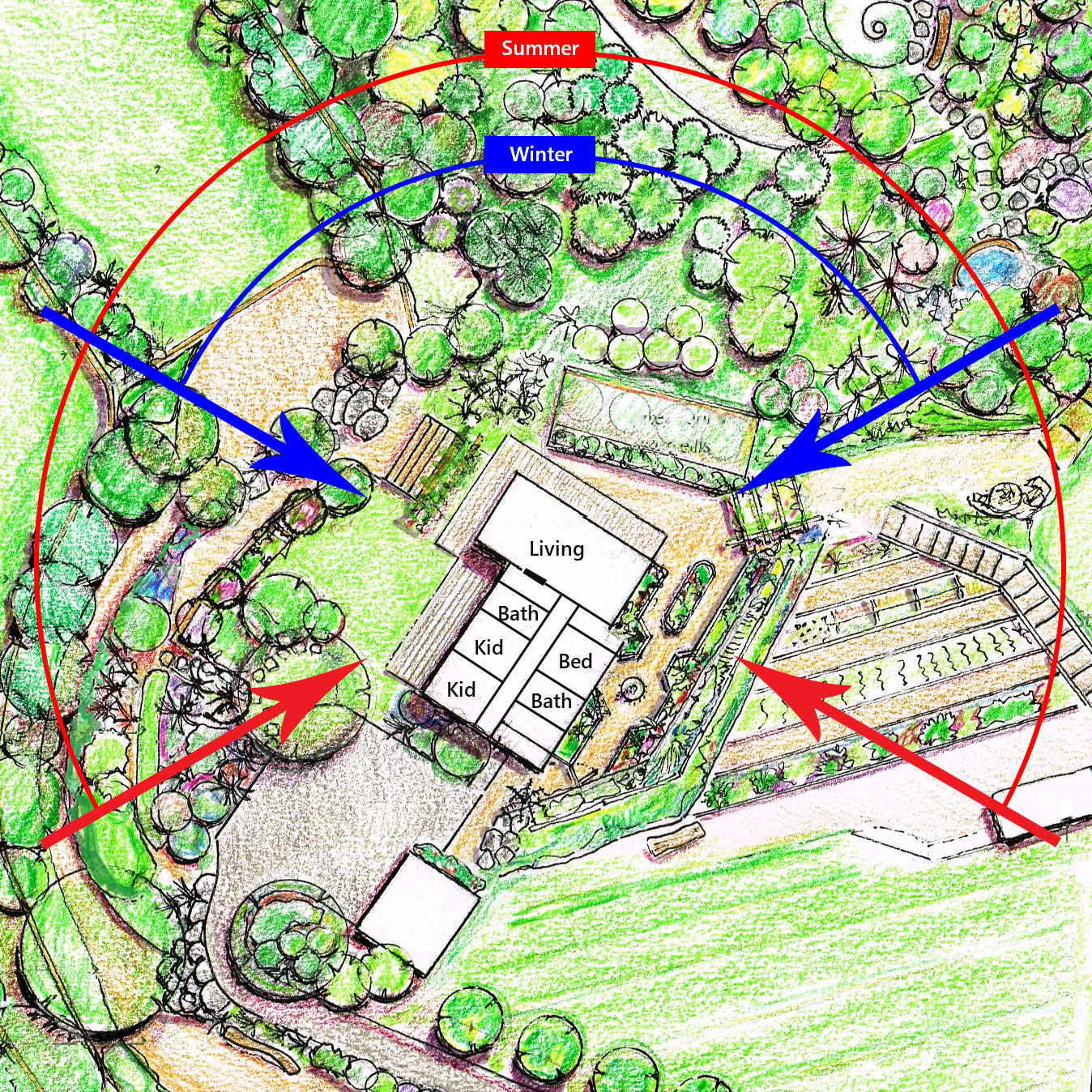
Most houses I’ve seen (and also the two I’ve built before) face directly to the sun side. That’s a good intention, but actually doesn’t work in my opinion. Why? During the summer time, having sun-facing windows unnecessarily heats up the whole house. Sun is most beautiful and useful in the mornings and in the evenings, so the ideal house should preferably be East/West oriented rather than North, right? But there’s one more argument to avoid a North facing house: You’ll also have a South-facing side that doesn’t gets any sun for six months of the year. Which results in wet walls that quickly get covered in green stuff.
My solution was to place the house at an angle of 38° which comes with some advantages:
- We can have sunlight from all four directions in the living room almost throughout the whole year.
- The eaves can be smaller on the Northern side while creating the same amount of shade at noon.
- The number of days where the Southern exterior walls get no direct sunlight is reduced to almost zero.
Form follows function
I can’t stress enough how important I think that is, especially since most architects nowadays totally ignore it. The design principle was expressed in the early 1900s as follows:
The shape of the building should be primarily based upon its intended function or purpose.
Think about it. We’re not building a house to satisfy our ego or to create a beautiful piece of concrete/timber mix on the hilltop. We build living space that serves us. It should not block us in whatever activity we want to do in or around the house. It should make us feel free and enable us to enjoy our time here.
With that in mind, I tried to keep things simple and functional while using up our building circle to the maximum. I actually didn’t once think about the exterior impression of the house for months. It was much more important for me to get rooms that work in regards of sunlight, views and practicability. It was also clear for me from start that the more straightforward the room layout is, the cheaper the whole house will get.
I presented my design concept to the builders and asked them to convert it into an actual building plan. After a few weeks they came back with three concept variants to choose from:
- My own layout without any significant modifications, except those required by structural engineering.
- An improved version that mostly focused on visual exterior design.
- A totally new layout as they would have proposed it if I didn’t give them any specific ideas.
Version 2 ‘improvements’ didn’t implement any function, e.g. sheet-metal covered walls free-standing away from the house, so we dropped that variant quickly.
Version 3 looked nice from the outside, but was wasting a lot of space inside by a not well optimized arrangement of rooms. As a result, all rooms would have been smaller for their actual purpose.
Honestly, it was not an easy decision to drop their suggestions though. Who am I to question the suggestions of a builder who is doing that stuff for a living? But again, we’re not here to build a house for anyone’s ego, so we decided to go for my original plan as it just worked best for us in all aspects.
Design considerations
Every feature of the house is there for a logical reason and derived from a requirement that we have defined upfront. Nothing is random or based on pure creativity.
Some of our considerations in detail:
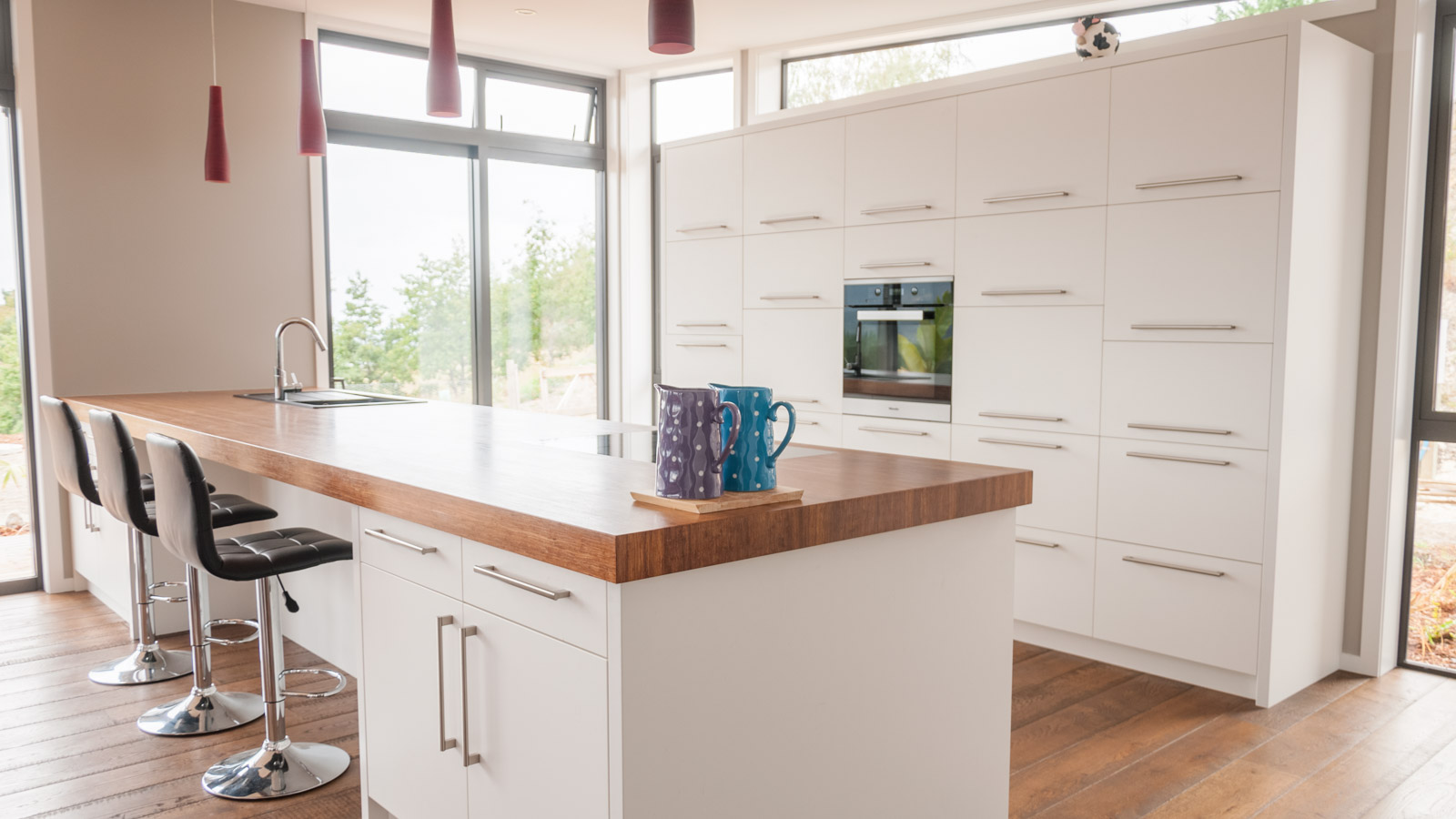
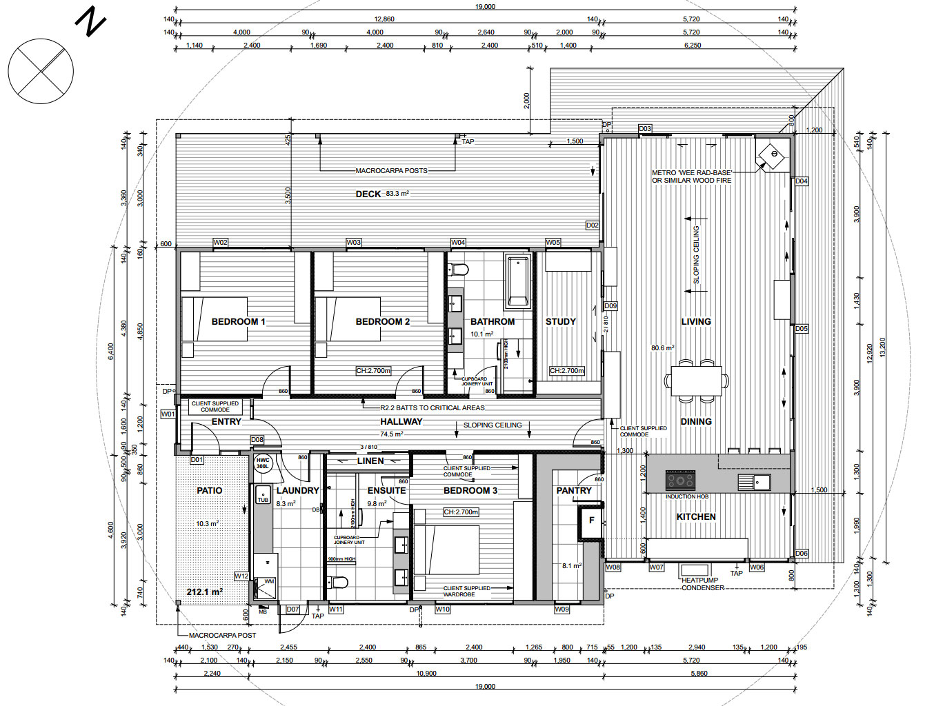
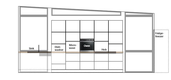
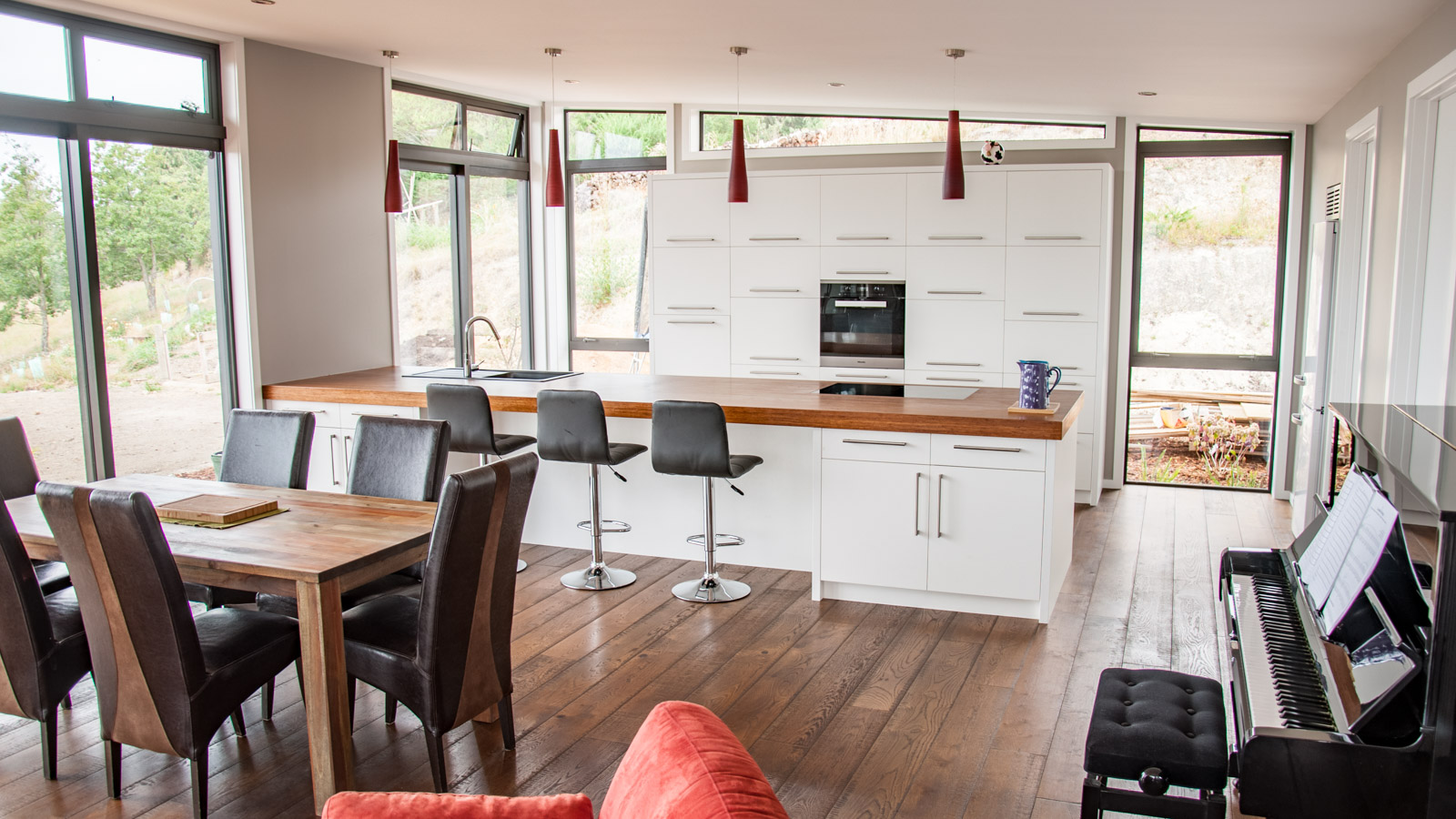
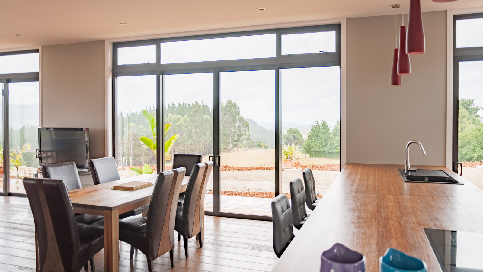
- Kitchen: It’s the center of our house where life happens. When cooking we would like to look ‘into’ the room, not against a wall. That’s why it was clear for us from start that the hob, sink and working area must be on a large kitchen island. A high wall cabinetry at the back further allows us to raise the dishwasher at a better ergonomic height (+30 from floor level) and the oven at a height that enables us to see what’s inside without bending over. The same goes for the microwave which is hidden behind one of the cabinetry doors at oven height. The dishwasher is located opposite the sink to make handling ways as short as possible. Also the main food preparation area forms a not too large circle from bench top to fridge/freezer to cabinetry to oven and back. On the front side of the island we have stools that are well-used by the children for having breakfast. The nearby sliding door implements the shortest possible way to our veggie garden.

Kitchen layout with appliances at useful heights 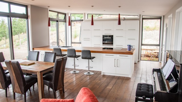
Kitchen finished - Pantry: Literally next door to the kitchen to keep ways short, with more than 8 m2 not too small, located on the coldest spot of the house as it only has a very small morning-sun window. Ideal for storing food and other stuff, and to recycle our waste.
- Dining: Located between kitchen and living area it has the best sea-views. Thanks to the large overall room size (80 m2) we can feel free while enjoying our meal there.

Dining area - Living: It’s the sunniest corner of the house with sunlight from all four directions. With direct access to the large covered deck and plenty of floor to ceiling windows and sliding doors we can enjoy amazing sunsets over the valley there. The little wood-burner in the corner complements our underfloor heating and adds a nice cosy effect during cold winters.
Large sliding doors for great sea views 
Large window front - Study: In early concept drafts I had a separate office room, but it didn’t feel right. On the one hand I didn’t want to waste too much space for the office, but on the other hand a room needs to have a certain size to not feel like a bunker. Attaching the study with a sliding door to the main living area is one of the details that I picked up during viewing our builder’s show homes.
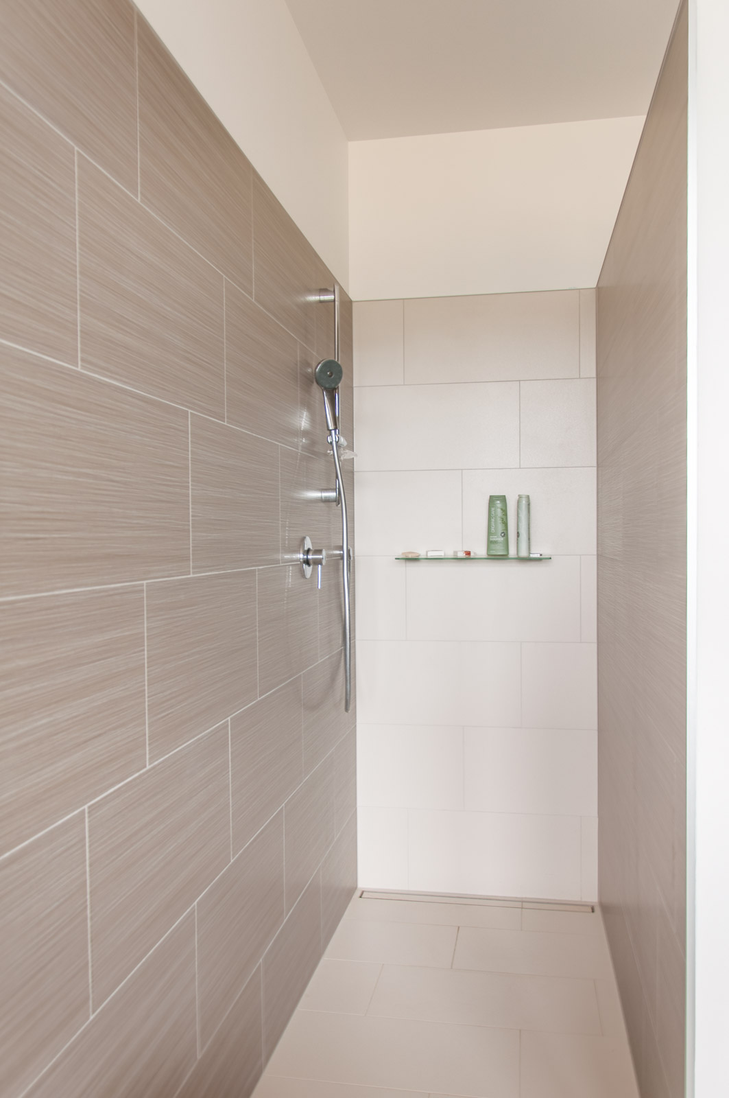
- Children’s bathroom: One bath tub in the house is enough, so the children should have it. The open shower without any glass doors is easy to clean, low maintenance and looking good too. Each child got their own basin and the mirror cabinetry hides their toothbrushes and beauty stuff properly.
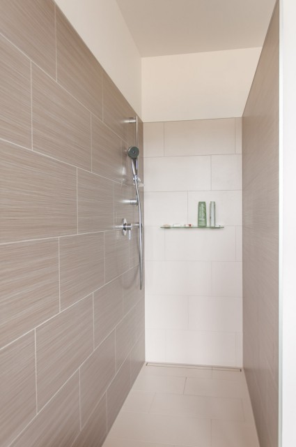
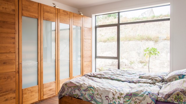
Open shower - Children’s bedrooms: Both bedrooms are not too small and have exactly the same size and shape, so the kids can’t fight about which room is better. The simple square layout allows them to creatively place their furniture wherever they want and change it from time to time. In opposite to typically very small and functional bedrooms in New Zealand we decided to create larger rooms for our children so they can get some private space as they grow up. With 18 m2 each, these rooms can almost be seen as little standalone studios. Large floor to ceiling windows to the deck side ensure a good amount of natural light. The non-stained decking timber will turn silver over time and reflect even more light into the rooms.
- Main entry: A covered area that is facing away from the main wind directions, keeping you dry when you have to look for your key.
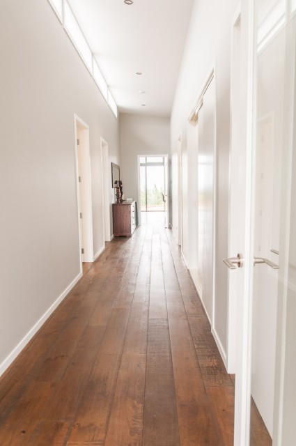
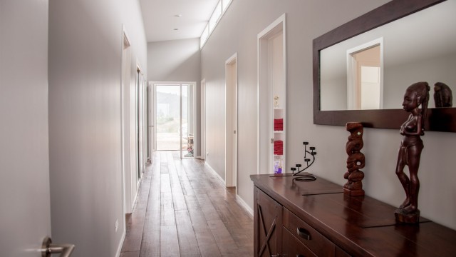
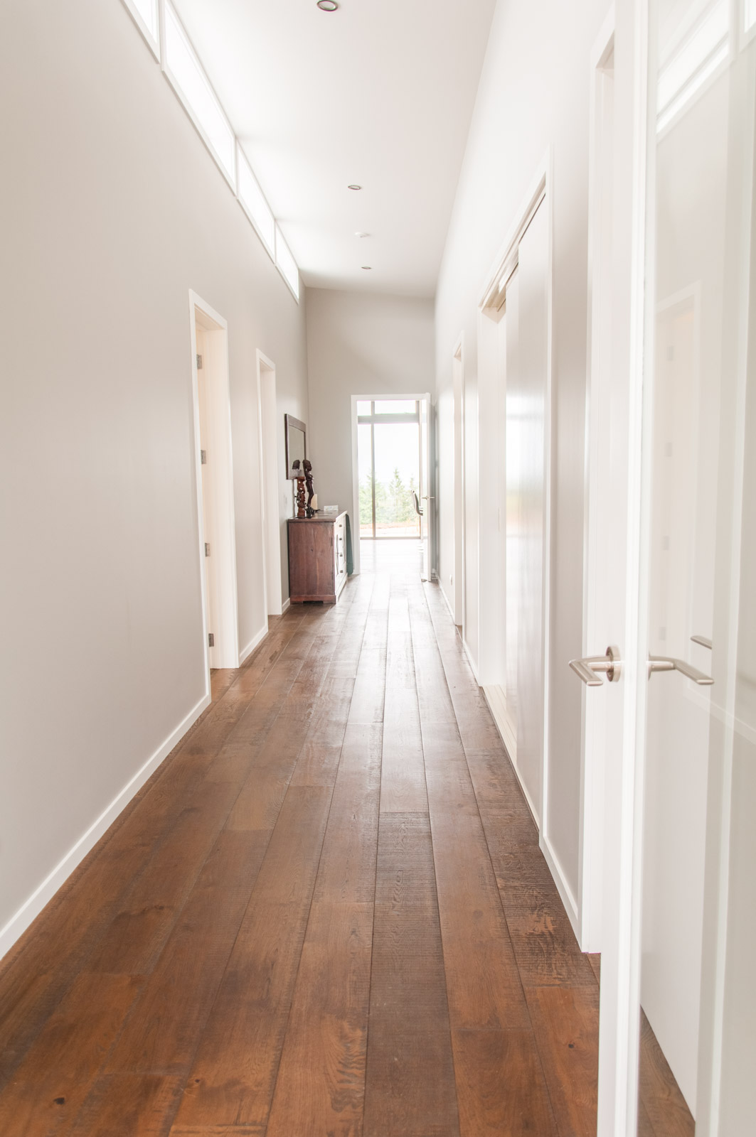
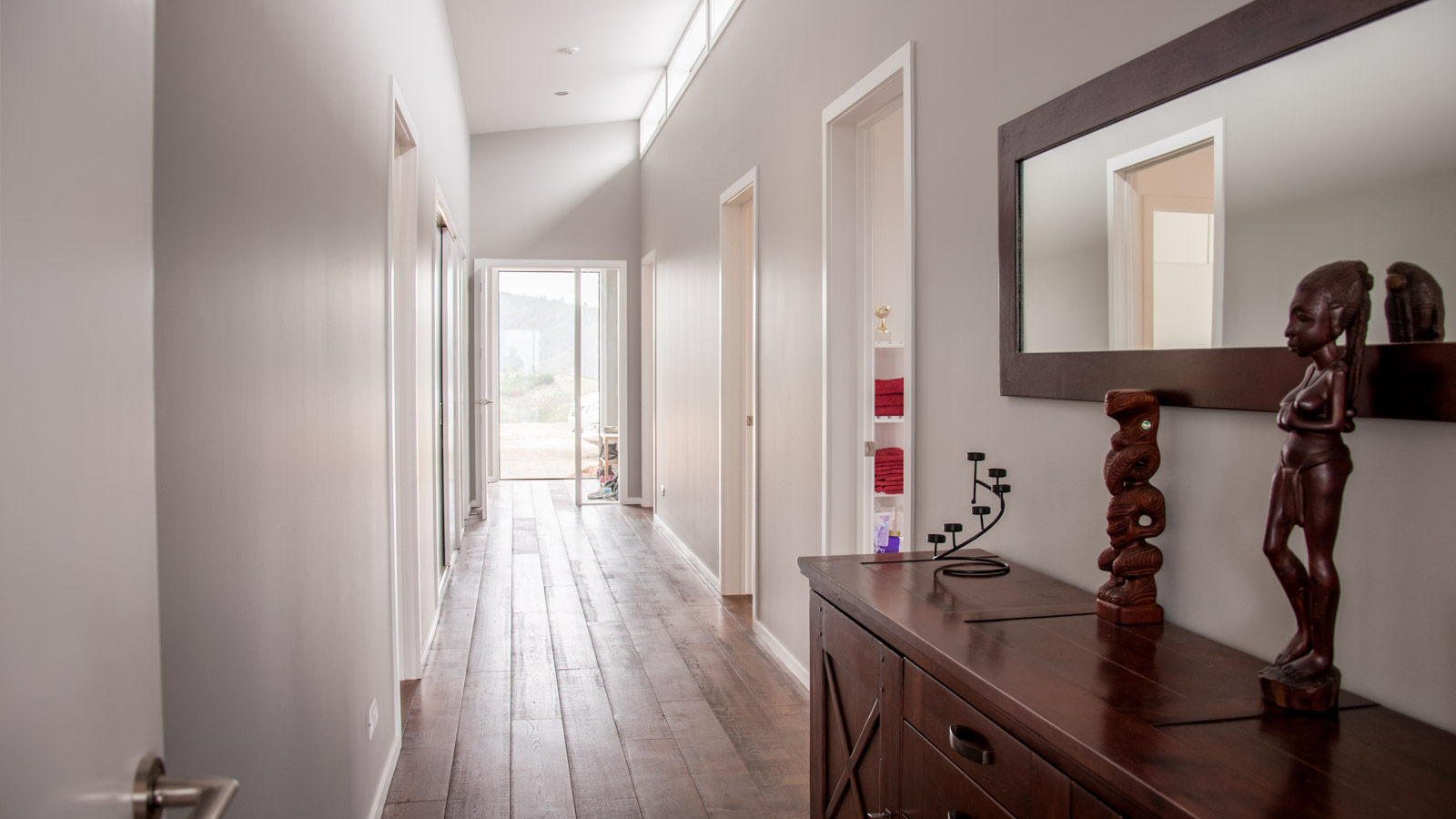
Hallway from main entry side - Hallway: It was important to make the hallway wide enough to use it as an actual room, for bookshelves, commodes and storage. Since it would have been a long dark strip in the middle of the house, we split the roof in two separate segments and created a line of clearstory windows. Windows left and right of the main entry door and another large window at the head of the hallway make sure we have no need for artificial light during the day. A further glass door at the entrance area makes sure that cold wind doesn’t blow through the whole house every time we open the main entry door in winter.
Hallway from living room - Laundry: It combines all the technical stuff in one room: Hot water cylinder, washing machine, underfloor heating manifold and pump, inverter for the solar panels and electrical distribution board. It also has got a sink for cleaning bigger stuff and a bench top next to the washing machine to sort and do the laundry.
- Master bedroom: Just large enough to fit our bed and our large wardrobe, nothing fancy as we don’t spend a lot of awake-time there anyway.
Master bedroom - Ensuite bathroom: Only accessible via the master bedroom, with an open shower, toilet and a double-basin again, very similar to the children’s bathroom.


Energy
It was quite shocking for us to see how far behind New Zealand’s building standards are when it comes to insulation. It was only 15 years ago when double-glazed windows became obligatory, and so far we haven’t seen any house built earlier which actually had them. Exterior walls used to be not insulated at all. As a result, it’s totally normal to have enormous power bills for electric heat pumps, which are the most common way of keeping houses warm. Many people just freeze during the few winter months or burn a couple of trailer loads of cheap timber in their little livingroom wood burners.
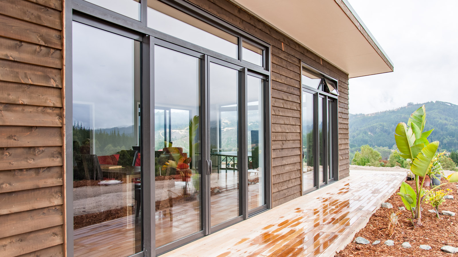
For us it was clear from start that we want to have proper underfloor heating throughout the whole house. We have also bought the best available windows (thermally broken aluminium frames with gas-filled double glazing) and made sure that the exterior walls are dimensioned well above building code requirements (20 mm timber cladding + 10 mm RAB board against the wind + 140 mm insulated stud wall + 13 mm GIB board).
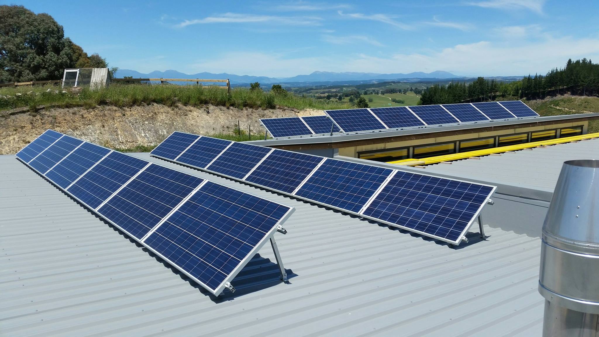
To be self sustainable within a reasonable scope we said we want to create most of the energy needed for our heat pump on our own, using a 6 KW photovoltaic system. During summer we’ll have a huge excess amount to sell to the grid (for 8c/kWh) and in winter when the photovoltaic yield is low we’ll buy it back to run our heat pump (for ~20c/kWh).
Passive solar design
The concept in a nutshell: Harvest free sun warmth in winter and keep the sun out in summer. It doesn’t require much to actually do that, but still most house designers unfortunately totally ignore it.
What we did to reduce the needed amount of heating energy:
- A well insulated concrete slab. Every sun beam that hits our (dark) glued-down timber floor warms up the concrete slab below. That thermal mass makes a great heat reservoir that gets slowly depleted overnight.
- Large windows to the North, small windows to the South. That helps harvesting sun energy and avoids too much losses on the shade sides.
- Optimized eaves. Their size must be thoroughly chosen so they ideally block all sun during summer when sun is high and let as much as possible in during winter when the sun angle is low.
Water
Only properties in our town center are connected to drinking water and wastewater infrastructure. Everyone living just a few km outside the town center, including us, have to develop their own local solutions. For tap water we have buried four concrete tanks, 23,000 liters each, which totals to 92,000 liters of water we can store. Concrete tanks keep the water fresher and cooler than sun-exposed plastic tanks.
The local council requires that we have 45,000 liters of water for fire-fighting available at all times, so we can effectively only use two of our tanks. 47,000 liters of water for the house still sounds like a lot, but it really isn’t. We have to expect up to 7-8 weeks without any rain during summer time which means our maximum daily outtake limited to less than 1000 liters a day. Most of that will be needed to irrigate our fruit tree orchard and the veggie garden. The total annual rainfall in our area is less than 1000 mm, which means with our roof area of 322 m2 we can only catch about three times the amount we can store and most of that comes down within a short period in winter. In short: We can’t afford to waste any water in summer.
Talking about waste: For our wastewater disposal we have picked a passive solution that doesn’t require any electricity to run. Most properties around just have a large septic tank with an air pump that runs 24/7 to support growth of good bacteria that breaks down all the ‘waste’. These tanks need to be cleared out by a professional every 2-3 years. If power goes off, you have a problem. Their pumps are also very noisy.
Our solution is a three component system called constructed wetland:
- A small tank to collect solids: Any solid stuff sinks down to the ground and compresses there over time. The tank needs to be cleared every 10 years only.
- A sub-surface wetland: Imagine a long pond (10 x 2.5 m), filled with 1 cm river rounds. Water level is about 5 cm below surface to avoid having a sandfly- and mosquito-breedingstation. The roots of the grasses that are covering the wetland are cleaning the water effectively.
- Buffer tank: A small tank collects the overflow and pushes it into irrigation pipes that provide water for our wind-break trees.
Materials and colors
I admit, when it comes to building materials I’m kind of fetishist on surfaces. E.g. I can’t stand any materials that feel like plastic. I love timber but it must be oiled of course. Getting the right color tone is equally important.
The weatherboard cladding is lawson cypress (smells great!) that is sourced locally, with a black stain, oiled twice.
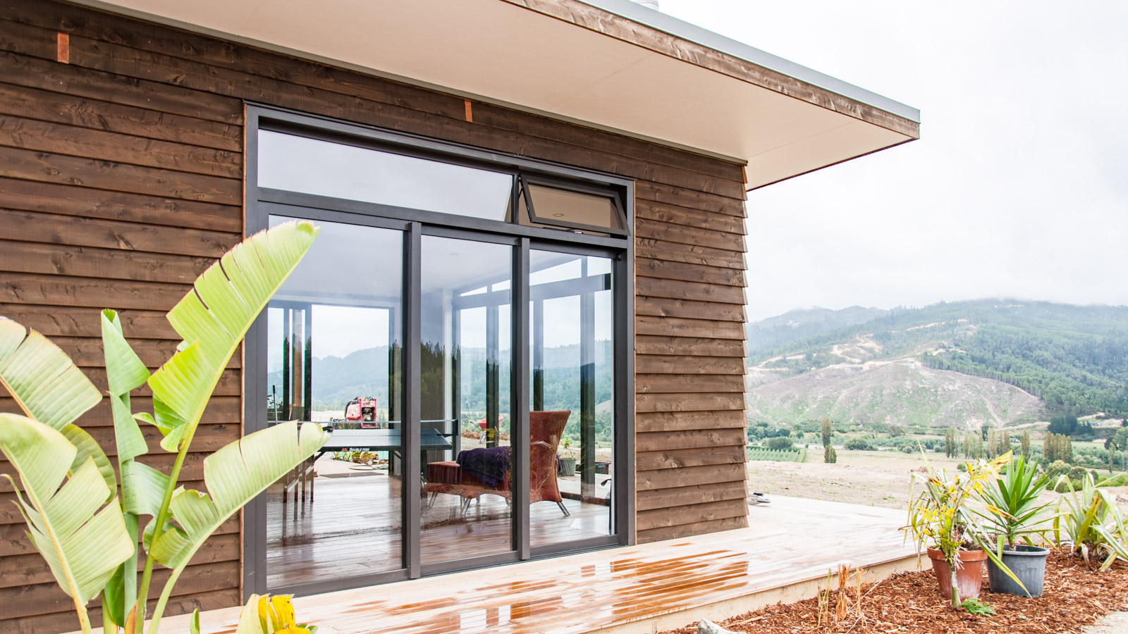
The window frames are powder coated in a color named Ironsand, the glass is not stained (still can’t get used to that weird NZ thing of using black glass for windows).
The roof is made of painted steel in Sandstone Grey.
The decking timber is vitex, a clear-of-knots hardwood, eco-sourced from the Solomon Islands (couldn’t find any similar NZ timber).
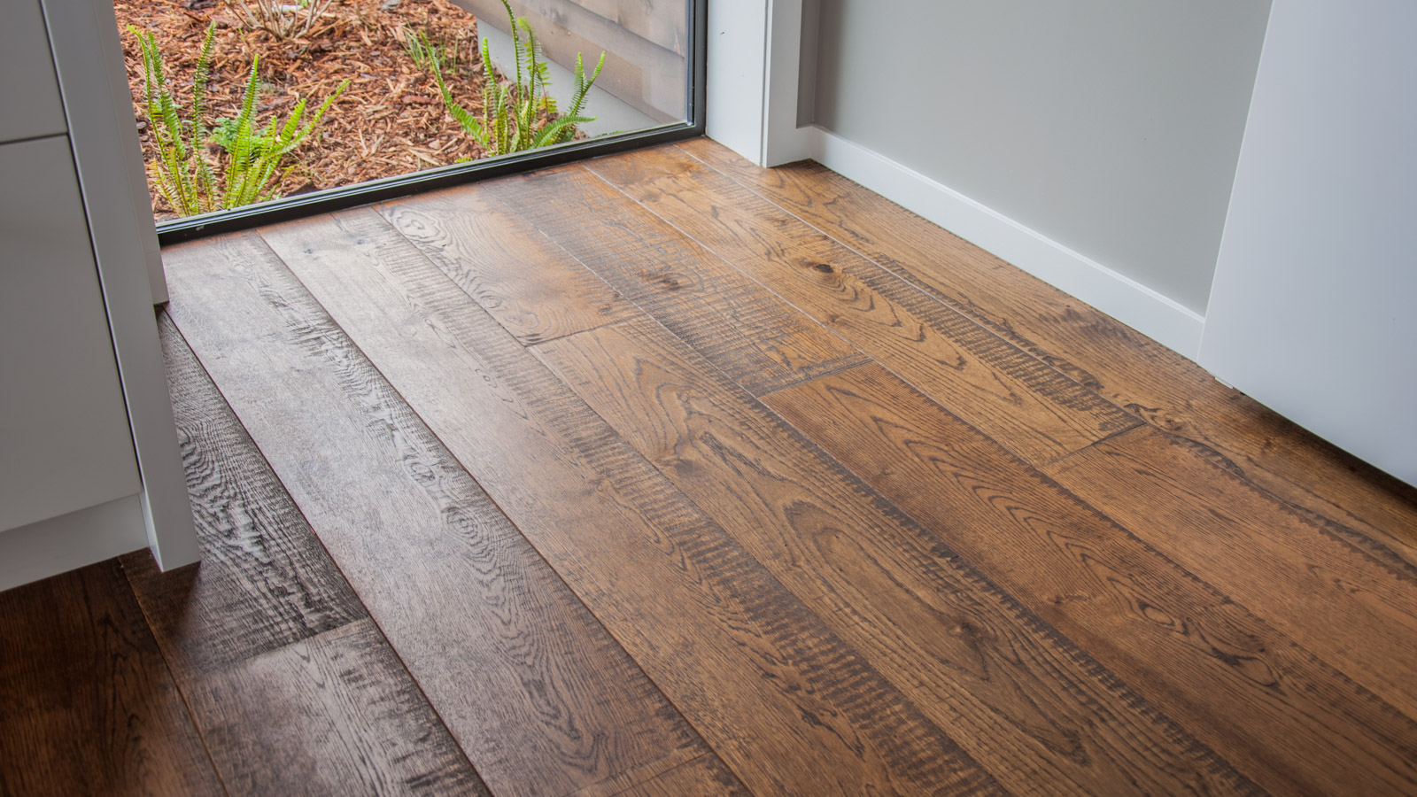
The floor throughout the whole house is a composite oak floor board with a custom band-sawn effect and bevel. For thermal mass it would have been best to use polished concrete only, but concrete feels to hard and cold for us. There is just nothing like solid timber.
The bathrooms are tiled with a partly glossy ceramic tile in 60×30 cm format.
The walls are painted with VOC free paint. We spent ages selecting the right tone of grey and came up with a color named 1/4 Friar Grey. The white walls and ceilings are Half Black White and the children’s bedrooms are Barley White.
Our kitchen cabinetry is white with a semi-gloss surface that has a nice touch. The bench top is a mitred compressed bamboo that is oiled in natural color.